Client Overview
Client: Coinread
Industry: Cryptocurrency & Finance
Objective: To create a modern, trustworthy, and professional brand identity that makes cryptocurrency information clear and accessible for all users.
Our Approach
Challenge
Coinread wanted a fresh and professional brand identity that would:
Stand out in the competitive cryptocurrency market.
Represent clarity, trust, and innovation.
Be flexible enough for digital platforms, print, and merchandise.
Use a consistent visual system across all channels.
Solution
We developed a comprehensive brand guideline that ensures consistency and recognition:
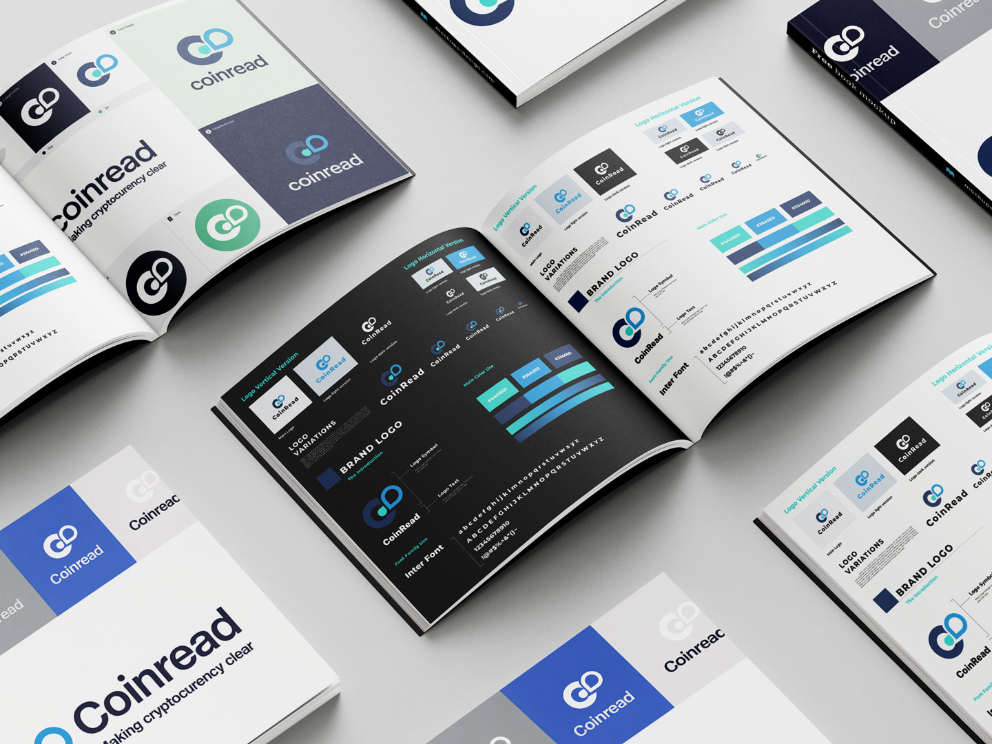
Logo Design
Created a clean, modern “CO” monogram logo.
Designed multiple variations (horizontal, stacked, icon-only).
Adaptable for both light and dark backgrounds.
Typography
Selected Inter Font for its readability and modern appeal.
Used variations for headlines, body text, and digital platforms.
Color Palette
Primary colors: Blue, Teal, and Navy for trust & professionalism.
Secondary palette for flexible branding applications.
Brand Applications
Business cards, social media graphics, and digital platforms.
Clear do’s and don’ts for logo usage.
Consistent grid and alignment system.
Visual Highlights
Logo variations (primary, secondary, icon).
Color palette applications.
Typography system.
Brand usage examples.
Clint Review


Results
- Delivered a bold and professional brand identity.
- Established a cohesive visual system across all platforms.
- Strengthened brand recognition, trust, and innovation.

Our Showcase
Here’s what we did
Contact Our Team
What Are You Waiting For? Let’s Make Some Magic Together.
Fill in our short contact form for a no-obligation consultation with a member of our team.
hello@marketmindstudio.com
+8801736163417
+8801705139522
+8801327192237